

A gauge chart, also known as a dial chart or speedometer chart, is a visual tool that uses a dial or needle to represent data and show how a metric compares to a target goal.
In this blog, we will discuss how to create a gauge chart in Sigma Computing, including configuring the chart’s colors using either single colors or scale options, formatting elements, and applying conditional formatting by value and percentage.
By the end, you’ll have the knowledge to design and customize gauge charts effectively for your data visualization needs.
What is a Gauge Chart?
A gauge chart in Sigma Computing is like a speedometer for your data. It shows one value on a scale, so you can quickly see how close you are to a goal or target. It’s great for tracking progress, percentages, or performance.
Here are a few common (but powerful) benefits of a gauge chart:
Easy to Understand: Just like a car’s speedometer, you can instantly see where you are, with no need for complex calculations.
Focus on One Thing: It’s great for showing one key piece of information, like how close you are to a goal.
Real-Time Updates: Perfect for live dashboards where you need to monitor progress or performance instantly.
Example: An e-commerce business tracks daily sales performance using a gauge chart. If the goal is $10,000 per day, and the current sales at noon are only $3,000, managers can take immediate action, such as running promotions or adjusting pricing, to boost sales.
How to Create a Gauge Chart in Sigma
Creating a gauge chart in Sigma Computing is straightforward and easy to follow. Simply follow these steps to visualize your data using a gauge chart:
Step 1: Connect to Data
Open Sigma in your browser and navigate to the menu pane. Click on Create New and select Workbook from the available options. This action will open a new workbook where you can start adding data elements.
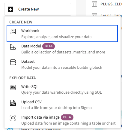
Connect to the data: Here, we will use data from a CSV file. To import the CSV file, click the plus sign in the top left corner of the Sigma Workbook (1). Next, click on VISUALIZATION under DATA ELEMENT (2), and then select the CSV file as the data source (3).
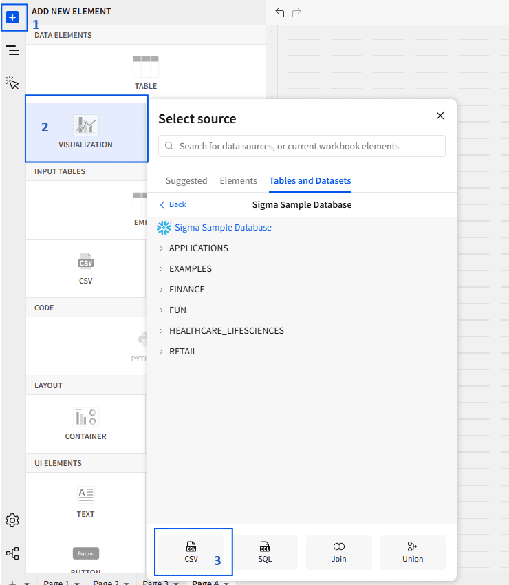
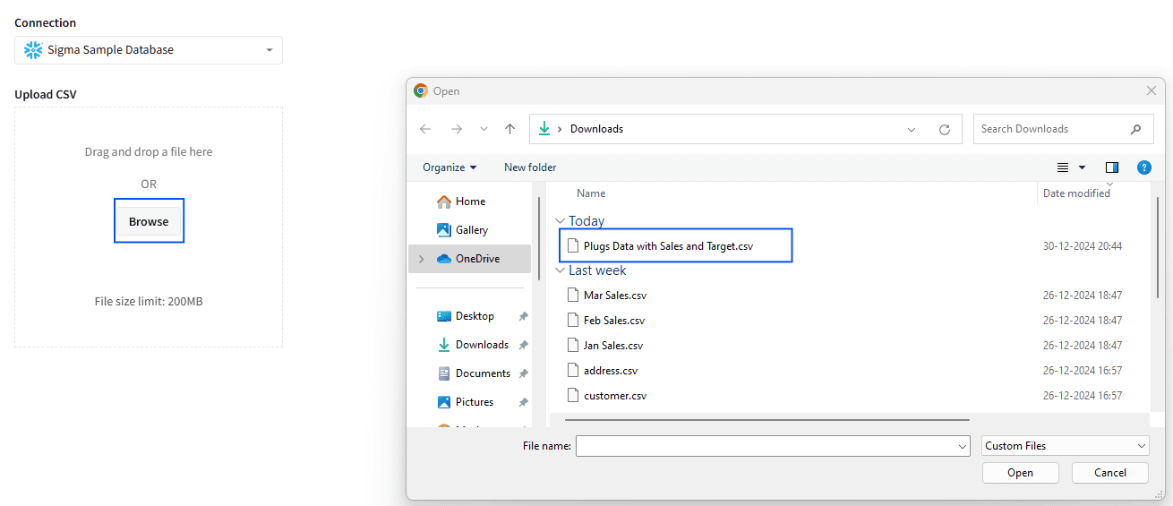
You will be prompted to select a source for the Visualization element. Click on the Browse option to select the CSV file from your local machine. In our case, we are using the Plugs Data with Sales and Target file.
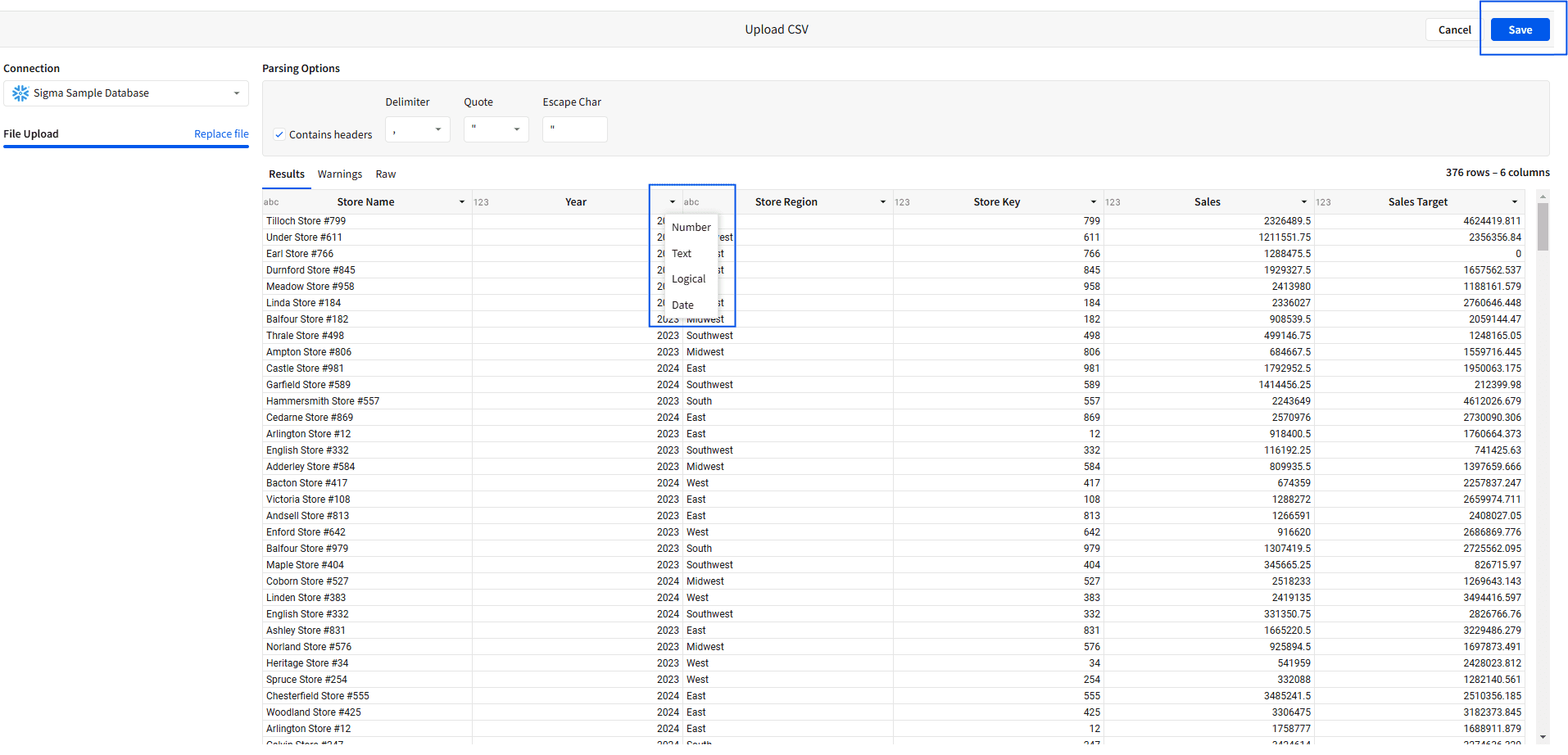
You will see a window to preview the data, where you can change the data types if needed. For example, you can change the year data type from Number to Text and then save the file.
Step 2: Build the Gauge Chart
You will now see a pane where you can choose the visualization type. By default, the bar chart is selected. To change it, open the drop-down menu in the visualization pane and select Gauge.
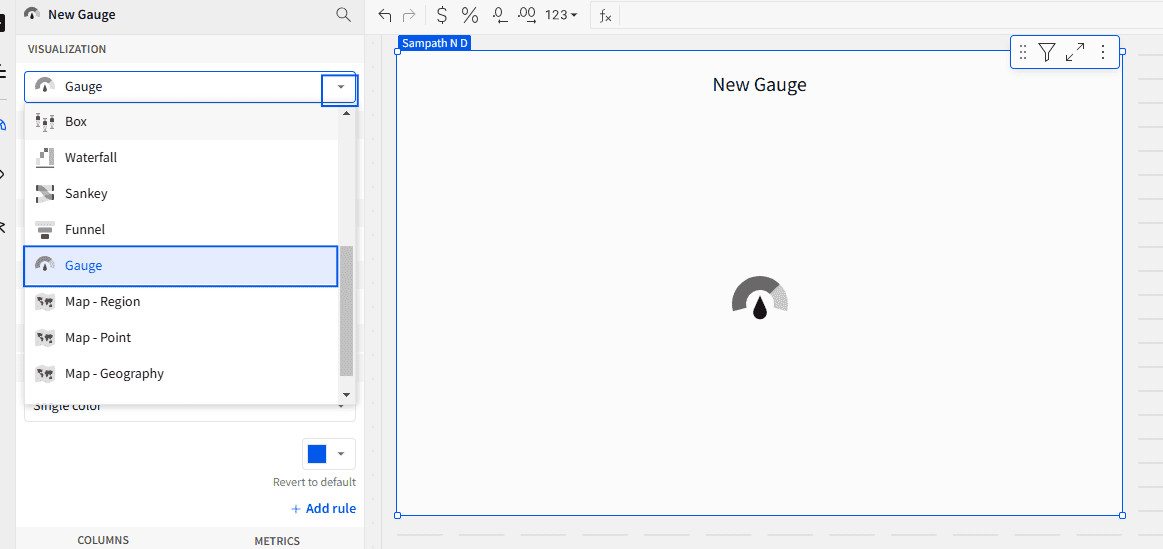
Now you are all set to configure the Gauge chart. In this case, we are creating a gauge chart for sales and its target.
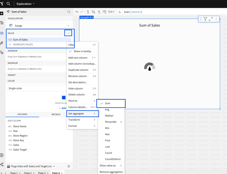
Add the sales information to the VALUE property in the configuration window by clicking the plus icon next to VALUE and selecting the sales column, or by dragging and dropping the sales column.
You can also change the aggregation type based on your requirements. By default, Sigma aggregates the measure using the sum.
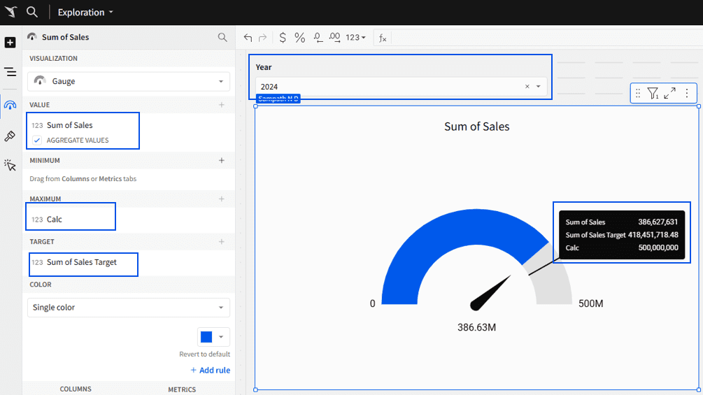
Next, you need to set the range for the Gauge chart (MIN & MAX). This can be done by configuring the column for the Minimum property, or Sigma will default the minimum value to zero.
For the Maximum property, you can either add a new column using calculations or directly select an existing column. In our case, we added it using the Add new column method by entering a 500M value directly in the function window as the Maximum.
Now, you need to configure the column for the Target property. Here, we selected the sales target column.
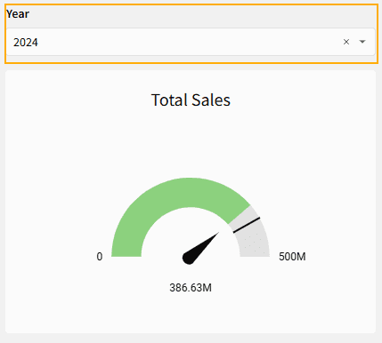
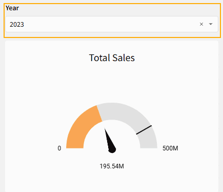
The data includes sales information for both 2023 and 2024. Since we are comparing sales with the target for each year, apply the year filter to the dashboard, set it to 2024, and convert it to a page control.
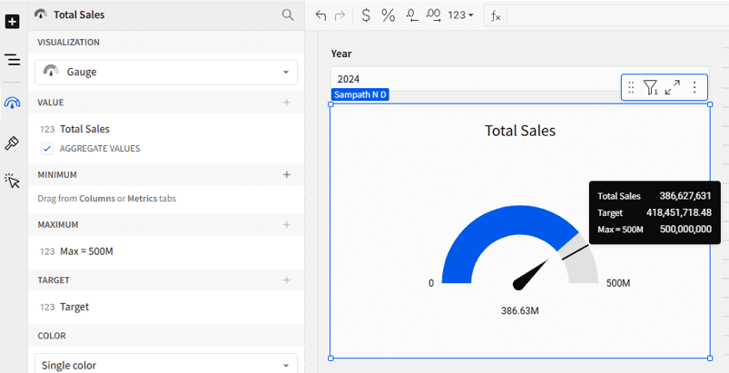
Whenever you add a new column, Sigma will automatically set the name to “calc”. When you configure an existing numeric column to a property, it will name it based on the aggregation. In our case, Sigma named the sales column as “Sum of Sales” in the value property. This name will also appear in the tooltip when you hover over the chart. To rename it, simply double-click on the column name and change it to your preferred label.
Note: There are two ways to add a column:
Use the Add New Column option to create a new column using calculations.
Select an existing column directly for a straightforward approach.
Step 3: Chart Colors Configuration.
We also have the option to change the color of the chart using Single Color or By Scale.
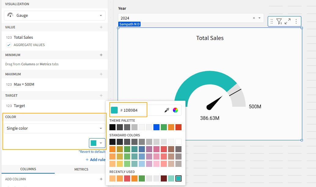
Single Color
This feature will fill the chart with a single color from the minimum value to the actual value. To select the color, you can either enter the hex code or choose from the existing color options.
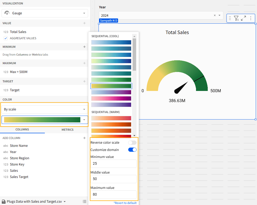
By Scale
This feature offers pre-defined sequential and diverging color scales. Select any one of the color scales that suits your requirements. You can also reverse the color scale by clicking on the toggle button. In the scale color section, you will see the Customize Domain option to set the color range from min to max according to your preference. For example, we set MIN to 25%, MID to 50%, and MAX to 80%, as shown below.
Step 4: Conditional Formatting
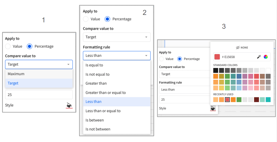
You can also apply conditional formatting to the color, but this feature is only enabled when you select the Single Color option by adding rules.
To add a rule, select the Add Rule option in the color property. You can add as many rules as you need. Follow the steps below to configure further.
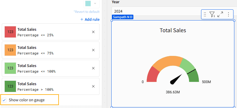
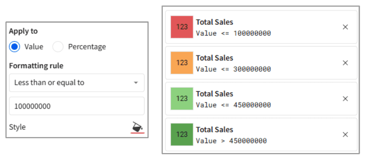
It offers two options: Value and Percentage. For demonstration purposes, we will select the Percentage option. This provides two additional options for comparison: Target and Maximum Value.
Next, select the formatting rule from the available options, as shown below.
Lastly, add the percentage value that you want to compare with the Target or Maximum value, and then select the color you prefer.
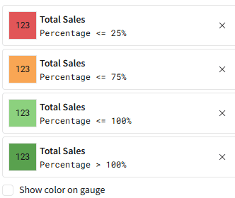
In our case, we created Four rules for <=25%, <=75%, <=100 and >100% as shown below,
The pictures below show how conditional formatting works. The first picture shows that in the year 2024, the actual value is greater than 75% of the target value, so the gauge color is green. Similarly, for 2023, the color is yellow because the actual value is less than 75% of the target value.
There is also an option called Show Color on Gauge. If you enable this, the colors will be applied to the gauge chart according to the rules, as shown below.
To create conditional formatting based on values, follow the same steps as listed above. Instead of using percentages, add the values.
Step 5: Element Formatting
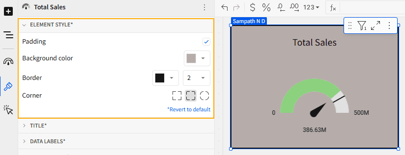
1. Element Style
Click on the Element Style section to reveal its options. It will show three options:
Padding – Tick the checkbox if you want to increase the spacing between gauge and its container or other elements
Border – This feature is enabled only when you tick the checkbox for padding. It allows you to set the border color and thickness.
Background – It shows the Background color option to change the background of your visualization canvas.
Corner – This option lets you change the corner style to Rectangle, Round, or Pill.
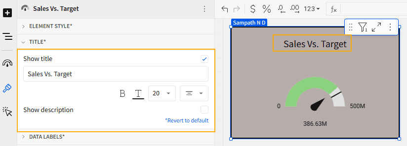
2. Title
Click on the Title section to reveal its options. Tick the Show Title checkbox to display the title for the gauge chart. Here, you can change the title of the chart and format it as needed. You can also tick the Show Description checkbox if you want to add a description to your chart.
This title is static, not dynamic, so you will need to update the title each time you change the measure.
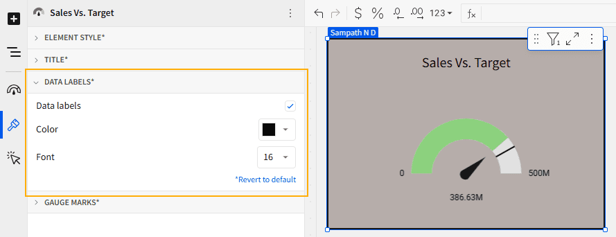
3. Data Labels
Select the Data Labels option to customize the displayed information. Adjust the font color and size, and make sure to check the Data Labels box to make the labels visible.
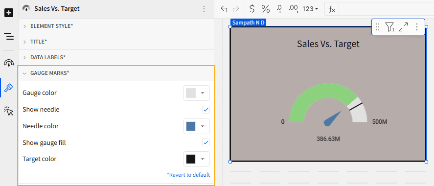
4. Gauge Marks
Click on the Gauge Marks to reveal its options. Here, you can customize the gauge color, needle color, target color, and also enable or disable the Show Needle and Show Gauge Fill options.
Best Practices for Gauge Charts
Set Clear Limits: Make sure your gauge chart shows clear markers like safe zones and warning levels, so people can easily understand where things stand.
Consider the Scale: Ensure that the scale of the gauge fits the data range. A narrow scale for a large range can make the chart difficult to interpret, while a broad scale for a small range may lose its impact.
Color and Contrast: Use contrasting colors to distinguish between the different ranges (e.g., green for good, yellow for average, and red for poor).
Keep It Simple: Gauge charts are best for showing a single KPI (Ex – Revenue, Profit or performance percentage) . If you have multiple KPIs, consider using separate gauges or other visualizations, like bar charts or line graphs, to avoid clutter (Ex- Sales vs profit).
Closing
Creating a Gauge chart in Sigma Computing is simple and doesn’t take much time. In this blog, we cover how to create a Gauge chart, its benefits, and how to apply conditional formatting to it. By following the steps outlined in this blog, you can easily create and customize Gauge charts to suit your needs.
For more help with Sigma Computing, reach out to the experts at phData!


