Tableau recently released the MODEL_QUANTILE() and MODEL_PERCENTILE() functions in Tableau Desktop 2020.3. These are game-changing for Tableau. They finally put regression output directly in the hands of Tableau developers. Specifically, MODEL_QUANTILE() allows any creator to calculate a predicted values AND store that value in Tableau. This also allows you to calculate the residual–the difference between the actual, and predicted value.
How it works
The MODEL_QUANITLE() function requires at leas three inputs:
- A quantile value where .5 is the predicted value from a regression model
- the outcome variable as an aggregate
- the predictors as an aggregate.
Example #1: Adding a Regression Line
The MODEL_QUANITLE() function means we can add a regression line to a plot. Technically we can already do this. But let’s do it with a function.
Let’s start with this viz that is a plot of Profit Ratio by Weighted Discount by Manufacturer and Region (using Tableau’s default Superstore dataset).
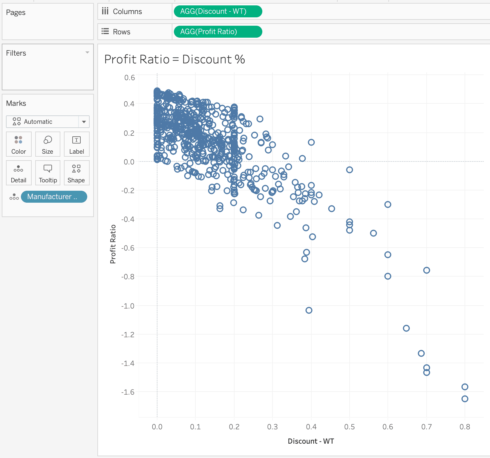
You can quickly create create a mental model of the regression line. Its a downward parabola.
We can create this regression with MODEL_QUANTILE().
// Model Values
MODEL_QUANTILE(
  0.5,              // Quantile
  [Profit Ratio]    // Outcome variable
  [Discount - WT]   // Predictor
)
This will create a linear regression.
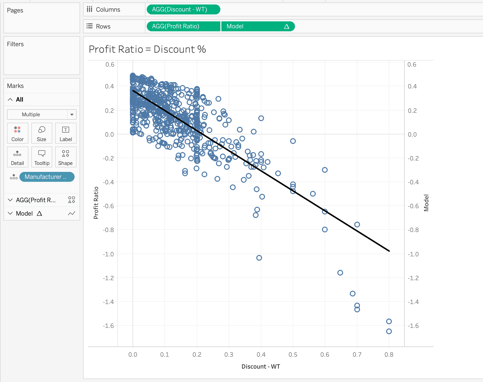
Of course this is a linear regression, but we really need to fit a different model type. You can do this by editing the model in the calculation. Lets make the model parabolic by changing [Discount – WT] to [Discount – WT]^2.
// Model Values
MODEL_QUANTILE(
  0.5,                // Quantile
  [Profit Ratio]      // Outcome variable
  [Discount - WT]^2   // Predictor
)
This changes the regression line:
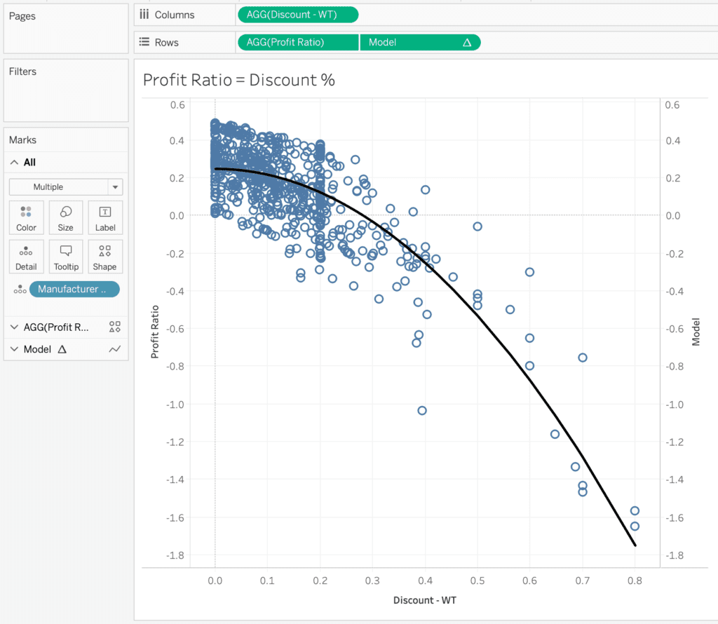
We could add additional predictors to the model (which is the amazing part). Lets add Sales, Profit, and Quantity.
// Model Values
MODEL_QUANTILE(
  0.5,
  [Profit Ratio],
  [Discount - WT]^2, SUM([Sales]), SUM([Profit]), SUM([Quantity])
)
This results in a less than desirable plot (but potentially more accurate) line that looks like the following:
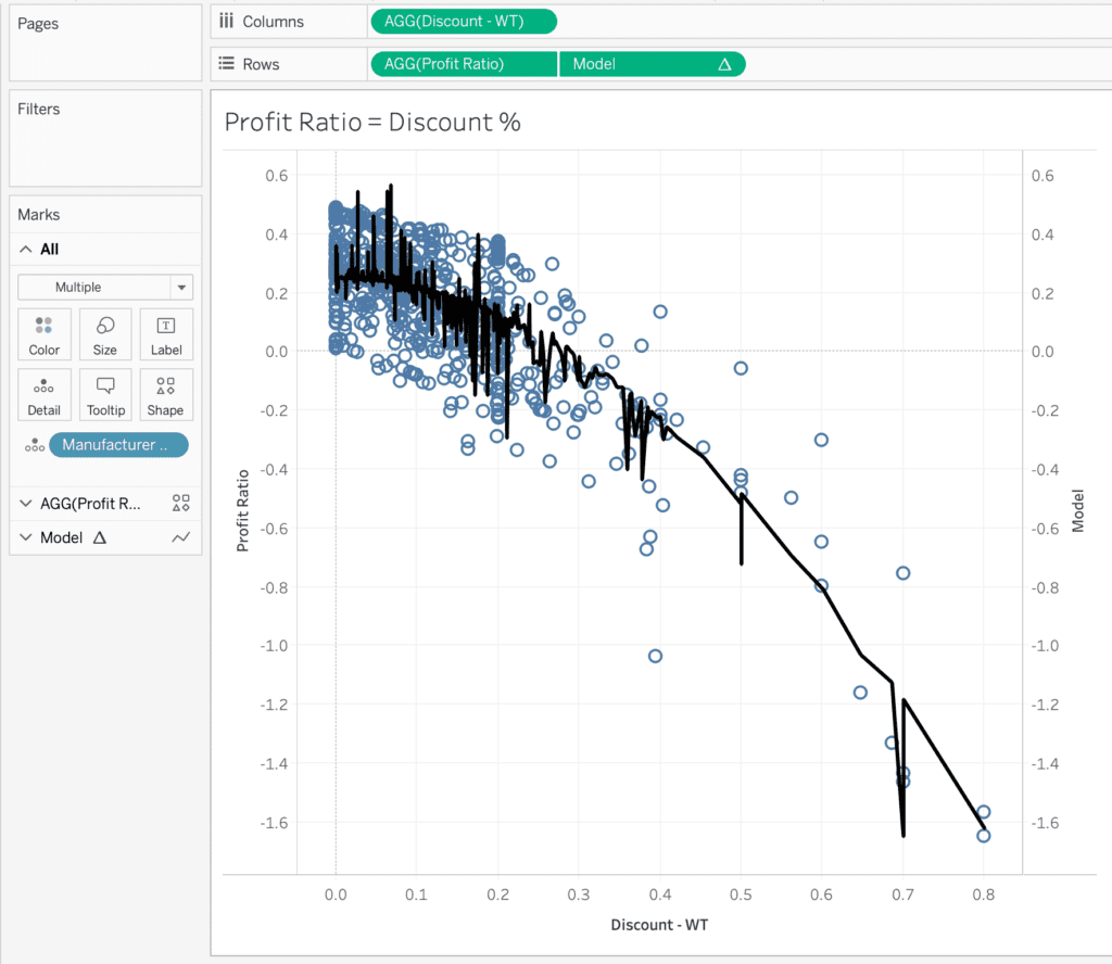
The predicted value line accurately represents the 50th percentile of the model (or the prediction). What’s better is compare these values against the predicted value.
This regression model minimizes the variability between actual values and the regression line. While it doesn’t guarantee it, a regression model should have the actual values evenly spaced above and below the regression line throughout the observed range. This is called homogeneity. It’s an assumption of a regression model (but not guaranteed). How can we test that in Tableau?
Example #2: Residual Plot
A residual plot will show the observed value minus the expected value. Again, values should be evenly spaced above and below the regression line throughout the range of the plot. To calculate this we just need to create the following calculation:
// Residuals
[Profit Ratio] - MODEL_QUANTILE(.5, [Profit Ratio], [Discount - WT], SUM([Sales]), SUM([Profit]), SUM([Quantity]))
And results in the following plot:
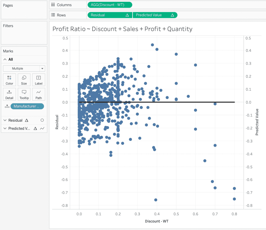
A visual analysis of this regression, while it looked good initially would say that from 0.0 to 0.1 the models seems to over-estimate, while 0.1 to 0.5 there is an under-estimation, and 0.5 and higher there is again an over-estimation. This is the power of MODEL_QUANITLE()–we are able to analyze the quality of a regression model directly in Tableau and use it’s output in calculations!


